

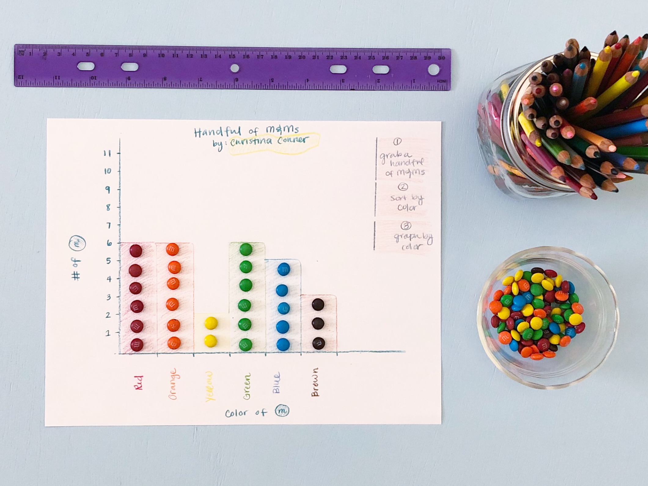
Did you ever graph the color M&Ms in a package? How cool was it to learn how to graph it on a computer?
MS Excel is my go-to when it comes to graphing and housing all my data. It’s familiar, and I continue to learn new things as I go (thank you YouTube and MS Excel forums!). Unlike some platforms where graphing is automated, MS Excel gives you the ability to control the different elements of a graph like these quality indicators taken from Kubina et al (2017):

Time Series
My biggest takeaway from this article was adding a time series. Of course I changed all my graphs from sessions dates to time series.

The data tells us a story.
The article explains how removing dates between sessions removes information between the two data points. The gap between the two dates creates curiosity and allows us to ask questions:
Why weren’t sessions conducted for 2 months? (vacation, schedule conflicts?)
Any other interventions occurring during the gap?
Any home programs to maintain the skill?
Add your questions here…
Again, the data tells us a story and gives us information we need as trainers to understand what is going on and what questions to ask.
Raise your hand if you’re pro automation. 🙋🏻♀️ I am all for anything that will save me time. Thankfully, Deochand (2017) has an awesome tutorial to automate phase lines, AND he found a way to use phase lines in a time series.
It’s just a win-win situation, and I’ve incorporated them in my Graph Templates.

The ability to graph data is essential to making clinical decisions in the field of applied behavior analysis (ABA). I've learned having a template to enter data in an organized manner has helped increase my productivity and workflow. This template highlights the following features:
Time series (consecutive date)
Conditional formatting to highlight session dates and weekends
Phase lines between dates
Target lists: intro and mastered dates
Problem behavior + intensity of behavior (partial interval)
Averages of recent problem behavior data (E.g. last 5 sessions)
Alternative spreadsheet layouts
Plenty of examples
Video tutorials
Report Template (.pptx) also included!
7 different layouts to insert graphs (includes 1 cover page)
Ability to hide sheets for fast exporting (PDF or print)
Plenty of space to add notes relevant to graphs
Examples sheets
This product is only for professionals with basic knowledge of MS Excel tables and graphs. Although there are instructions and videos to optimize your experience with this template, I do not offer technical support for this template.
Let me show you the different ways to save time.
Copy/paste templates
Templates for different types of measurement
Conditional Formatting to recognize weekend vs weekday
Conditional Formatting to recognize session vs no session
Column for phases lines (Deochand)
Graphs with quality indications by Kubina
Ready to step up your MS Excel skills? These ready-made templates are ready for you, right now. After purchase, you’ll be sent a link for immediate download. Plus I’ve got video tutorials to guide you through the template.
Video Tutorials:
Graph Template Tour
Report Template Tour (add ongoing comments to your graphs)
How to Copy Your Templates
Adjusting Dates on Your Graph
Selecting Data Series to Format Your Graph
Entering Ongoing Data
Conditional Formatting
Phase Change Lines
Data Labels
Use this transparent graphic to make sure your line graph is within the 3:4 to 5:8 horizontal to vertical axis ratio. Download it for free in the Resource Library.
Report Template
If you’re required to put together monthly reports like me, I’ve added my Report Template to compliment your graphs. I designed the template through MS PowerPoint so it links directly to your MS Excel graphs.
My favorite part is the ability to hide slides. This makes exporting current programs a piece of cake while also keeping previous programs.

You can have your cake and eat it too. (Sorry! I couldn’t help myself!)
Got questions for me? I’d be happy to answer them!
References:
Kubina, R. M., Kostewicz, D. E., Brennan, K. M. & King, S.A. (2017). A critcal review of line graphs in behavior analytic journals. Educ Psychol Rev, 29, 583-598.
Deochand, Neil, "Phase Change Lines, Scale Breaks and Trend Lines Using Excel 2013TM" (2015). Master's Theses. 622.
