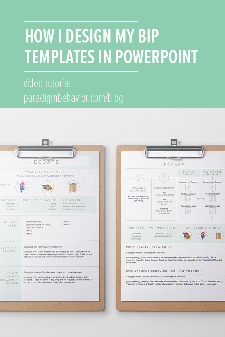
The past year I’ve become somewhat of a “design lady” because of the PDFs I create for Paradigm Behavior. The funny thing is, I don’t have a design background. I do, however, love a good data sheet.
Since my mission is to create user-friendly products, I tend to design with thin lines and light accent colors, and I really try to keep the information down to 1-2 pages. The last part is definitely a challenge, but probably the most important piece to keep in mind. Want to see how I design my templates? Well, I put together a video on how I designed my two latest behavior intervention plan (BIP) templates using MS Powerpoint.
To learn more about behavior intervention plans (BIPs), read my previous article about it here.
The video is approximately 25 minutes long, so I jotted down a few key points with the corresponding timestamp so you can refer to the video anytime.
Key Points
(0:56) Inspiration
I use Pinterest for design inspiration. I’ve noticed graphic designers take something mundane like a resume and completely transform it into something beautiful that stands out. It helps draw the reader’s attention to important information without making them feel lost, which is something we want when it comes to training staff and parents with our behavior plans.
(2:37) (6:04) Shapes, Lines, and Accent Colors
You’ll be amazed how shapes, lines, and accent colors can break up text. It adds space and highlights different sections in your text.
Useful buttons:
(4:51) Alignment
(7:05) Hold SHIFT to create perfect shapes like squares, circles, and straight lines
(7:50) Line thickness
(9:38) (11:22) Pictures inside shapes + crop tool = no more distorted pictures!
(12:00) Distribute shapes evenly
(13:32) Adding space between your letters
(21:38) How to manually size your pictures and keep it proportionate
After the video, I went ahead and cleaned up the templates even further so you can grab them on my website. Here are the things I did:
BIP 1
Made the green accent bar at the top thicker.
Added weight to the border line around the entire document.
Reduced the middle rectangle to one shape and extended it across the document. To separate the text, I added vertical lines (3pt).
Aligned the bottom 3 sections so they were evenly distributed.
BIP 2
Thickened the green accent rectangles behind “problem behavior” and “replacement behavior”
Throughout both BIPs, I made sure I only used 2 fonts: Raleway (titles, subtitles) and Arial (body text).
I hope you enjoyed the tutorial, and I can’t wait to see what you create! If you prefer to buy this Powerpoint file, it’s available below:
[For Professionals]
As mentioned in the blog post, this Behavior Intervention Plan (BIP) template is created to make behavior plans user friendly by using everday language and creating a fun layout. Formally, a behavior plans ranges from 5-15 pages and are extremely thorough. However, use this 1-page template as a simplified version designed to be used in the moment with the child for parent, therapist, paraprofessionals and anyone who works closely with the child. They are made to look friendly and easy to read.
This document is available on Microsoft Word and Powerpoint. Included are 4 templates based on a video tutorial that can be seen here.
BIP Template (docx) - 2 single pages, two designs
BIP Template (pptx) - two pages, two designs
BIP Instructions (pdf) - how to customize your documents
7 - Signature Paradigm Behavior Picture Icons (jpg)


